On Silver Seven's New Look: an Interview With Alanah Abels
Silver Seven's got a fresh new look!
When the masthead at Silver Seven gathered to discuss the news that Vox was shutting down most of SBNation's NHL coverage, there were a number of elements from our site that we felt were important to our community and hence, wanted to preserve: our namesake (✅), our url (✅), our archives (✅), our comments section (❌), and finally, our logo.

I remember visiting the Hockey Hall of Fame in Toronto sometime in the 2000s, taking in the exhibits about the history of the game, and seeing very little about the rich history of hockey in the Ottawa Valley region. I happened upon a single keychain in the gift shop that listed the team's four Stanley Cup victories in the newly established National Hockey League (1920, 1921, 1923, and 1927) and purchased it. It has been with me ever since.
That keychain – the Stanley Cup in particular – was my entryway into learning about the dominance of the National Capital Region's professional hockey teams, most notably, the Silver Seven. While each masthead member has their own story as to how we first learned about Ottawa's hockey history, it was clear to Ottawa-based graphic designer and illustrator, Alanah Abels, that it was important to us when we sought out her services to update our brand.
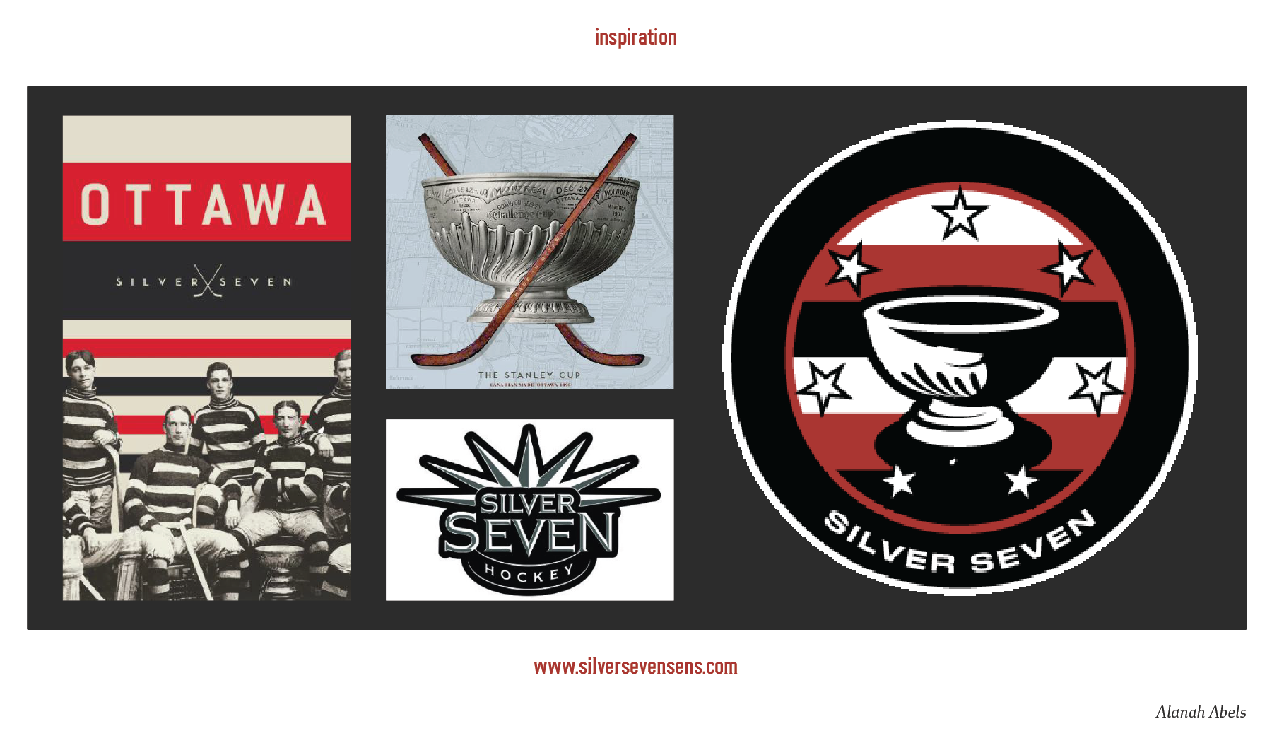
"Right away it was agreed the cup had to remain as the core of the logo," Abels shared. "I could see that the [old logo's] origins were inspired by an old-school style that served its purpose well in the past, however, in the kindest way possible, I agreed that it could use an update! A little modernization to increase its visibility and visual appeal without losing its core inspiration."

"My four big sources of inspiration were the prior Silver Seven logo, a vintage-styled poster of the original Ottawa Silver Seven, the Silver Seven Hockey logo, and a poster of the 1893 Stanley Cup. I used the 1893 reference to get a better representation of the cup's unique detailing, then separated the cup into three shapes to bring in other elements, like the colour stripping of the prior logo as well as the design or the vintage-style poster. I also took inspiration from the poster for the colour palette; it worked well to update the prior logo's colours while remaining similar to the original design."
When thinking of new elements to add to the logo, Abels went back to the roots of many hockey logos – crossed hockey sticks – and thought about a way to include an element of them subtly without repeating the pattern. "I included a silhouette of sticks within the base of the cup as a little nod to the crossed sticks that are present in the vintage poster, as well as to give a touch of visual interest to the base of the cup and balance out the top third of it."
Her favourite part of our original Silver Seven logo? "The dynamic shape," replied Abels. "I didn't go as drastic in my design, however, I used it as a reminder to play with visual placement and attention-grabbing elements. It motivated the creation of the jersey-styled S7 logo submark."

Readers can expect to see more of the submarks that Abels has designed in our new shop for merchandise – you can also get 10% off all merchandise by signing up for the "Brady Tkachuk" or "Daniel Alfredsson" tiers of paid subscriptions.
Silver Seven was set up by fans of the Ottawa Senators looking to build a community and discuss the happenings of our favourite hockey team. All of us on the current masthead have other jobs that we do full-time, and love having this space to express different aspects of our creativity. The serendipity in having Abels work on this with us is that her life is set up similarly, with graphic design and illustration being her way of expressing creativity and supporting community:
I was that kid drawing in class while half-paying attention to my teachers so it was clear illustration was a passion of mine from the beginning. I especially love - from way back then to now - drawing original characters, either from my own stories or from those created with friends, and most often inspired by the fantasy genre. However, throughout my education, I realized the obligation to draw was putting at risk my enjoyment of something I hold so dear. That led me to explore other creative professions and graphic design quickly caught my interest, especially brand identity. I find it extremely rewarding to work with clients and provide a service that allows them to discover and express their personal and/or professional visual identity.
We love our new logo and we hope you do, too. Both our masthead team and Abels were hesitant to make this change – Abels shared that she hadn't done much sports-centred design in the past, and no one wanted to disorient any current fans with a completely new design. We're all glad that we didn't let that hesitation win out.
Abels is currently in the process of rebuilding their website, but once it's up and running again, you can support their work here: alanahabels.ca. For those wanting to know more about her goals and interests, Abels shared: "I'm a TTRPG and fantasy nerd who keeps jumping between character design and learning how to create playable maps for the low-vision and the blind, all while exploring brand identity design." We encourage you to support local artists and creators whenever and wherever you can. With our newfound freedom, our team at Silver Seven are excited to explore more opportunities to engage our tremendous community, and that includes you.
Thank you for all of the support you've shared during this transition to being an independent platform. Whether it's reading articles, commenting, sharing with your community, or providing monetary support, we are so grateful to be doing this in service of you. We hope to bring you the type of coverage you have come to expect, and grow with the team in hopes of building respectful, inviting, and authentic spaces that our fanbase deserves.
